Webby Award Critique: Reuters.com/ Ocean Shock
The Webby Award is a prestige award that honors the best in the spectrum of the internet. The Webby Awards provides awards to different categories such as websites, videos, advertisements, media & PR, apps, mobile, and voice, social, podcasts, and games. By the International Academy of Digital Arts and Sciences, a combination of technology innovators and internet experts, awards are chosen by them. Reuters.com/Ocean Shock, a recipient of the Webby Award, has won Best Navigation/Structure, which was under the Feature and Design compartment for websites. Since this is a highly acclaimed website, this may pass to be legible. Going through the site, it presented well, and it seems user-friendly. While evaluating this website, I will be heavily looking for their search engines, their aesthetics of their pages, the flow/navigation through the site, and their access to accessibility (with the help of WAVE, a web accessibility evaluation tool). Also, I’ll look for their website’s adaptability of their design in different devices (such as phones vs. tablets vs. laptops), and their medium. With all the accumulated details, this will allow me to prove that this site is usable and that it does deserve its Webby Award.
Reuters.com/ Ocean Shock is an online research and informational project where it provides reports of information regarding climate change and aquatic animals within the oceanic environment. Over time, some stories display significant change within the marine community, and this shows how this affects the living organisms in their dwelling area over a period. With this type of information, this allows the audience to open their eyes to see how their actions are linked to other ecosystems and how humans are very unaware of how climate change is related to them. Initially founded by Reporter Maurice “Mo” Tamman, this project covers topics such as marine migration, missing species in different countries, the disruption in the seafood market. It discusses the future of seafood in the market. With the information, this defines their mission: to inform others about the issues in marine life and persuade others to make a movement for change and to be more mindful of the environment. This site is great for researching, and it does please the eyes by including its colorful pictures, animations, and real-life stories, making this site attractive. Although this site appears to be great, there are some minor mistakes I will point out further on, and I believe it should be corrected or added.
THE HOME PAGE
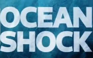
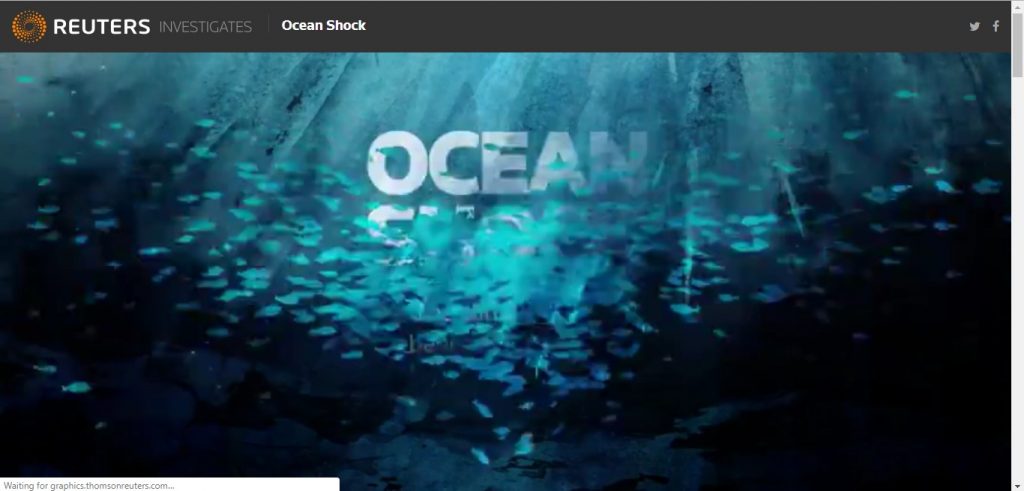
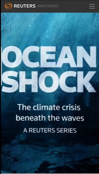
When opening up the Reuters.com/ Ocean Shock page for the first time, I was amazed as to what I saw. It opened up to a beautiful, vibrant, full-screen animation, which depicted a swirling school of fish going around in a circle and then dispersing. Wavy features and bubbles were also included. After the dispersing, the title immediately appeared, stating: “OCEAN SHOCK” in big, bold white letters in the center of the page, and everything became static. In the background, it gave the essence of being underwater as it implemented colors such as light and dark blue, black, and streaks of white. Thanks to all the colors and the animation, it gives us a sense of what is the leading website focus, which is the focus of aquatic life.
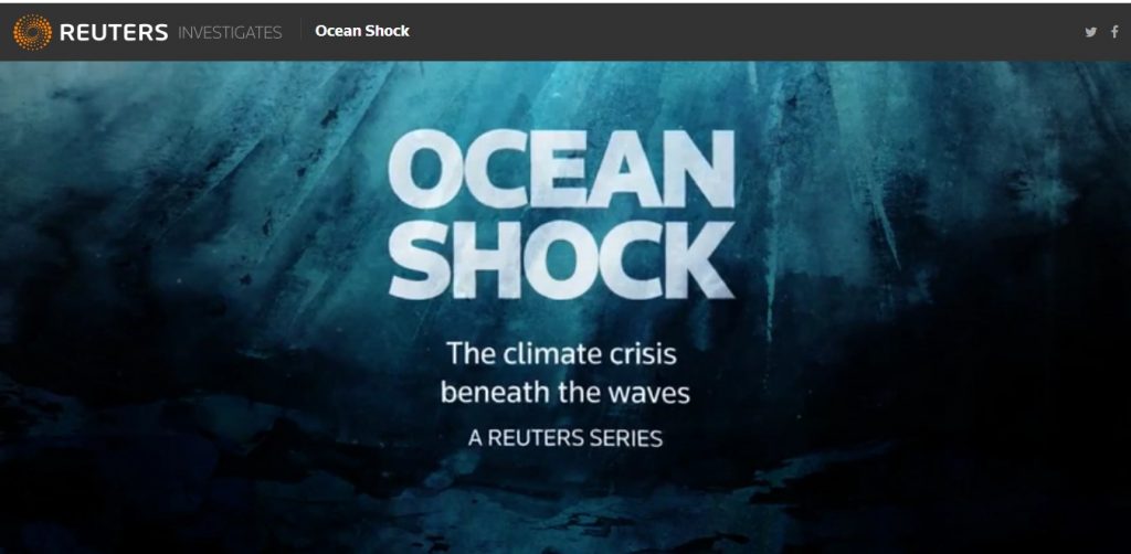
Below the title, it states, “The Climate Crisis Beneath the Waves.” The title is also bolded and in white. The title, in total, is ten characters, and due to that, this makes it easy for browsing. With all of this being displayed, I would say it is a bit busy; however, I believe it set the tone right, and it gave a positive reaction to the page.
At the top of the landing page, the site’s logo is presented stating, “Reuter Investigates” while being beside the logo’s image.
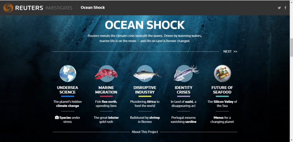
Moving on to the rest of the landing page, I noticed the menu section while scrolling down. The menu section seemed a bit particular to me as it does not compare to other menu sections I’ve seen before. With other sites, the menus are usually on the top bar on the page, and it would be set horizontally or set as a dropdown. However, with this menu section, it fills up the page and has a title with it. On the top of the menu, it states, “Ocean Shock,” bolded, with its description below it saying “Reuters reveals the climate crisis beneath the waves. Driven by warming waters, marine life is on the move — and life on land is forever changed” both in white. Below that, it then presents what is there to offer. Going into five categories: Undersea Science,”, “Marine Migration,” “Disruptive Industry,” “Identity Crisis,” and “Future Seafood.” Each topic is color-coded as it shows a bar of color below each topic title. Under each issue, placed in vertical order, they have individual articles or reports that pertain to that subject. For example, the piece, “Fish flee north, upending lives,” fits right under the “Marine Migration. I appreciate that the articles are put out on display so that the user can find it quickly without searching for it. When continuing to scroll down the page, the menu section shows up once more at the bottom
Furthering on with inspection with the landing page, it led me to the “welcome” section. With the aesthetics of this section, I would say it is pleasing because it is effortless to read, as it is white words on a dark background and the font, and the size is moderate. Plus, with the actual message in the welcome section, it was able to capture my attention by using imagery. With the imagery aspect, I was able to visualize the issue at hand and understand the cause behind this project. I find this necessary because if younger students would like to use this site, grabbing their attention is the way to go. Above the “welcome” section, there is an “About this project” hyperlink, which goes straight into another page describing why this website was built in thorough detail.
I feel satisfied and positive with the overall presentation of the first landing page, and I can say I was impressed. Just by looking at the home page, I concluded that the page is not overwhelming, busy, there is a right balance in the spatial arrangement, great color choice of the background, and the navigation through the page is simple and straight forward.
GOING THROUGH THE OTHER PAGES
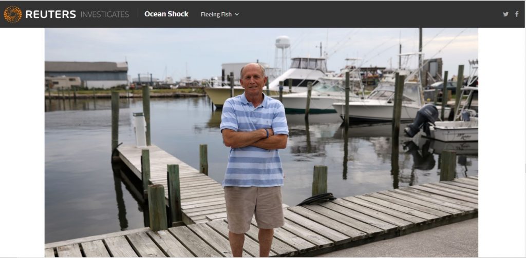
When clicking on the category of “Marine Migration,” it led me straight to an article titled “Fleeing fish, upended lives,” written by Maurice Tamman, a reporter, and photos provided by Shannon Stapleton. When entering the page, the page immediately greets me with lovely painting, and then it dissolved very smoothly, which led me straight to the title, similarly like the home page set-up. I enjoy the animation within this website because it just makes the website livelier and vibrant, and it just stands out compared to other sites I’ve seen. The report explains how significant migration of animals in aquatic life, due to climate change in the water, can profoundly affect human beings and their daily lives, whether it is the seafood market or their diet. In the article, the reporter speaks to individuals going through situations that connect them with climate change, and with this added, it allows me to understand the issue more and gives me a perspective on other people’s life. One significant element of design this site uses is the usage of photos and animations, as well as videos. Having multiple modes of communication on the website can improve the user’s experience, and this will allow them to connect more with the text and the given information. In the article, photos were presented either in the middle of the page or beside the book. The images mainly contain images of people going through everyday life, and it shows the struggles due to climate change in the water. With the photography design, they were mainly positioned in eye level, medium, and up-close shots. With these shots, it emphasizes the realism in the condition and depth of the situation.
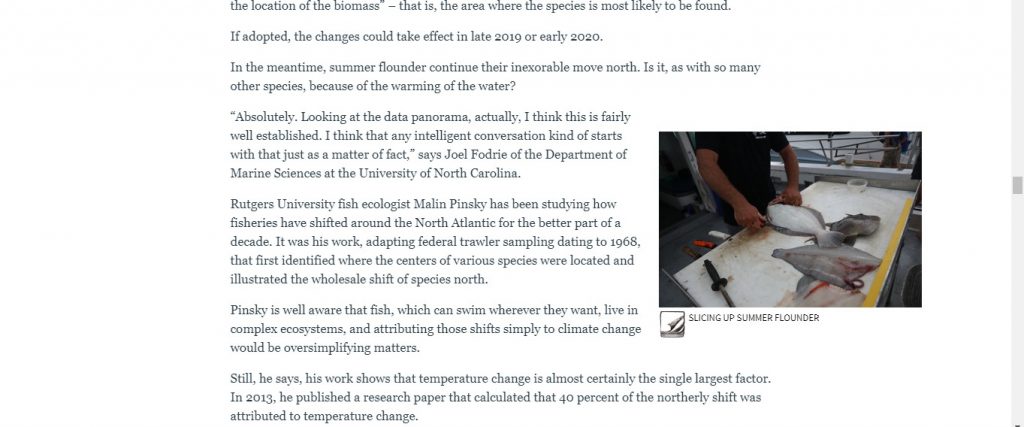
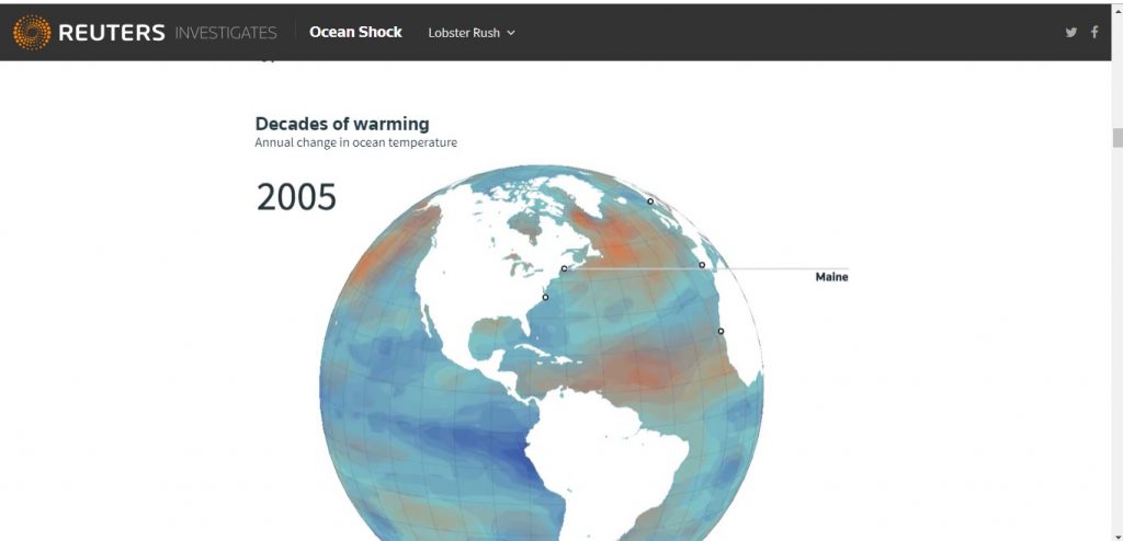
As for the lighting, the photos mostly display cool light. With cool lighting, this type of illumination shows more of “middle of the day” vibes, and it brings a more realistic, every day, kind of mood. Thanks to photography, it provides a visual aspect to the story. What I can also appreciate is that they add scientific images as well, such as 3D graphs and animated 3D photos. With the scientific evidence, it put more emphasis on the situation, basically showing how environmental issues can affect the human and aquatic atmosphere. These photos are very colorful and vibrant, and with the labels included, this allows more understanding of scientific research. The same set up goes for all the other pages that follow. Now going for the aesthetic side for these articles, they are straightforward to read as it is on a white background, and it is set at a moderate font size. Overall, when thinking about the different audiences, this site does a good job trying to connect with different demographics (mainly high schoolers and above) due to the different types of modes they bring. With a great mixture of videos, photos, and texts, there is a way that everyone can get involved and be interested in it.
ACCESSIBILITY
Although Ocean Shock is going well so far with the review, there are still some things this site needs to work on. According to WAVE, a web accessibility evaluation tool), the three main issues Ocean Shock needs to work on are alternative text, empty links, and blank buttons. With the alternative text, this allows individuals who are visually impaired to understand what the images are about. Without having alternative text, the screen reader will not be able to describe what the photos are verbally, and this will give the individuals a hard time. To me, I find this good that the full images do not have any problems; however, they do need to fix it. As for the empty links and buttons, some links or buttons lead to nowhere. This error also can mislead the screen reader and make it difficult for individuals with impairments. Overall, everything else seems to be ok, and this site has a good profile, according to WAVE.

SOCIAL MEDIA
With having a website, it is essential to promote and share your website to get more viewers and followers. In this site, it does not hesitate when it comes to putting their research project out there. On any page, the social media icons are found in the top right corner of the page. It presents Facebook and Twitter. With these icons displayed at the top, this makes it easier for the user to check out their prominent social media accounts, and they can share, which will help the site gain more participants. They add another plug for social media at the bottom of the page. At the bottom, they add more of their social media accounts such as LinkedIn and Reddit. I think they did a great job implementing this to their site. When I checked on their Facebook page, I was impressed by how much people view their work and how much followers they received. One video they posted gained 12 thousand views, and many of their posts were shared. They post meaningful and exciting content, such as documentary of issues at the aquatic environment and land, and they were able to connect with their followers, which I find great.
DISPLAY
Ocean Shock also does a great job of formatting its website design to different devices. When comparing the website on various devices such as the phone, laptop, and tablet, the site still carries its features such as the animations, photos, and everything else. The same goes for the tablet. No issues occur when comparing, and it all looks the same. The website must conform to whatever device that is being used, and this site does a great job at that.
INSPIRATION
When looking at Ocean Shock website design and content, I was amazed as to how vibrant, innovative, and intriguing the site is. This site is how I want my website to be as. With comparing my website to this, I can see there are some similarities such as the navigation, the color template (which is blue/purple), and the mission of the site: to teach others. While looking at Ocean Shock, I took some notes as to how should I develop my website further on. I want my site to have a modern, bright feel, and make it user-friendly. So far, on my site, I have a menu, a couple of pages, and an icon/ logo; however, I am still in the construction stage.
FINAL OPINION
Overall, I enjoyed evaluating this website. Ocean Shock is an excellent website for learning and researching, and this site carries many advantages for the users. Their detailed yet simplistic design and their navigation make for an entertaining and captivating experience. I learned a lot from this site, and I appreciate all the thorough details that go into building this website. After evaluating, this proves that this site is Webby Award-worthy, and I understand why this site was chosen as People’s Voice.
Sources: